Painting Demonstration 1
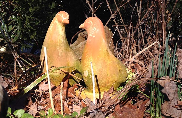
As you can see, I toned down the background a lot in the sketch. A winter garden up close can be interesting, but not in this photo! Notice the rose bush from another Valentine's Day behind the doves. Cue, awww…. He gave me a rose bush every year until we'd filled up the garden!
So I want a nice dark background for the doves to show up against. I'm exaggerating this quite a bit. This sketch is for me, not a finished painting.
Painting Demonstration 2
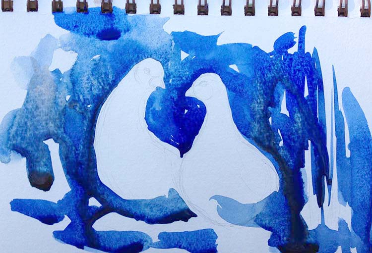
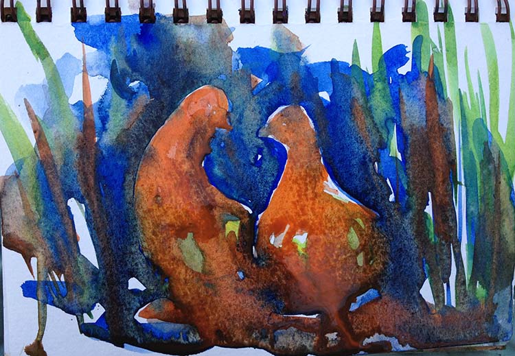
I'm going with a good strong ultramarine blue to negative paint the first wash. The blue will contrast perfectly with the oranges of the doves, while the real browns and reds would be too subtle to contrast. I'm going for exaggerated values at this stage since the texture effects are rather subtle. If the light / dark and color contrast values weren't exaggerated, the light colors of the texture would be lost.
Notice whenever I negative paint an object I always pull the colors into the shadow areas. If you don't pull the background into the objects, it looks cutout, photoshopped onto the background. The real shapes are the value patterns not the objects.

Painting Demonstration 3
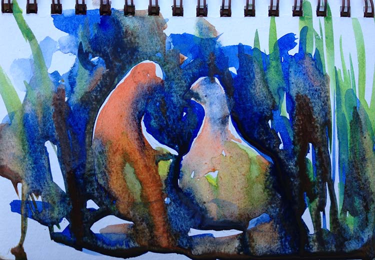
While the ultramarine blue is still wet, I float in burnt sienna and pthalo green. I want the background dark but indistinct. I start adding a little extra pigment to my heart shape. While everything is soaking wet, I start painting on the doves. Part of the texture is background reflections, after all.
I start adding some color with cadmium red and cadmium yellow. The cadmiums are very opaque, chalky colors so they're a good match for the terracotta. If the doves were a vitreous shiny red glaze, I would use quinacridone red. Pay attention to more than just the pigment color. The opaqueness and mixing qualities matter just as much!
I use a bit of the greens in the birds and a bit of the reds in the background.
Don't worry about washes bleeding a bit. As you can see, the right side dove's head had the background wash bleed into it. I just blotted it with a rag and moved on!
Artist Tips
If you don't pull the background into the objects, it looks cutout, photoshopped onto the background. The real shapes are the value patterns - not the objects!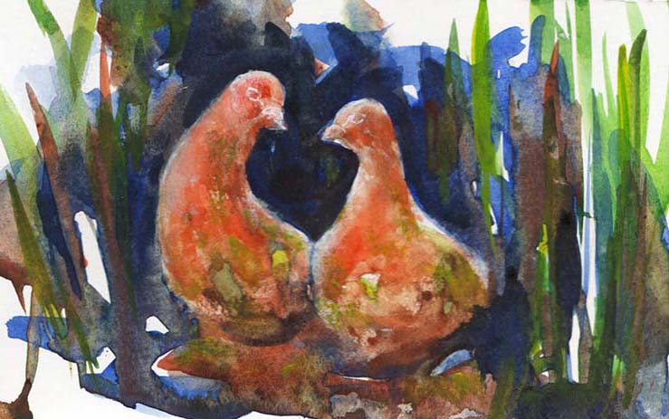
Painting Demonstration 4
All the washes are still quite wet, but I'm moving on! One reason I might end up using a bit more gouache on a sketch than a painting is not waiting for sketches to dry. In this case, I'm planning on using quite a bit of white gouache on the statues so I'm not really trying to reserve whites much. I want the chalky opaqueness of white gouache!
Don't mess around too much with paints once you've let them flow, the safest way is to let them dry completely. I just don't always wait! But if you're a beginner, ALWAYS wait for your wash to dry. I want the wash here to flow into itself and make interesting backwashes.
Final Watercolor Sketch!
I enjoyed this sketch a lot. I am a complete romantic and I like painting a gift from my husband. I really enjoyed the terracotta texture of the statue. It was fun to build that up in several layers and top it with the gouache. All in all, a fun afternoon sketch!
Do you have any interesting statues or stonework to sketch today? Concrete usually has intriguing reflections. Old stone walls are full of mossy textures. Think about textures when you sketch today and try to highlight the roughness of stone or the smoothness of marble. Or the chalky orange of terracotta! Have fun!

Related Art Lessons